Drill into every service, account, and dollar.
Cost Explorer is the working table for your unified spend — every Azure service and AWS service, every subscription and account, in one searchable, sortable view with period-over-period movement built in.
One table, both clouds
Azure and AWS line items side by side, with provider badges — no console-hopping.
Search, filter, sort
Find any service or account instantly; filter by provider; sort by cost or change.
Movement at a glance
Each row shows how it moved against the previous period, so growth stands out.
Export-ready
Take the current view to Excel or PDF, matching your filter, currency, and tax settings.
Four capabilities
most tools skip.
Cost intelligence without these features forces workarounds. Tax reconciliation in spreadsheets, topologies drawn by hand, service-level spend with no way to filter, and reports that only exist in someone's inbox. CloudOptify handles all four natively.
Tax handling
SettingsAzure Cost Management returns tax as separate line items. How those tax rows appear in your reports, team allocations, and budget alerts is a business decision — not a fixed behaviour. CloudOptify gives you three modes, configurable per organisation.
Tax rows are counted in all cost figures. Totals match the Azure invoice exactly. Default for all organisations.
Tax rows are stripped before any calculation. Totals reflect pre-tax spend only — useful when finance reconciles tax separately.
Tax rows are stripped, then the total tax is redistributed proportionally across every service row. Each team and service absorbs its fair share of the tax burden — the most accurate model for chargeback.
The tax mode applies across all cost views, team reports, budget alert calculations, and scheduled reports — one setting, consistent everywhere.
Cloud Map
VisualA visual topology of your entire cloud estate — all Azure subscriptions and AWS accounts, their hierarchy, and what each is spending. Designed for the moment when a list of account names is not enough.
Hierarchical node graph: org root → tenants → accounts. Click any account node to see its service breakdown and cost KPIs in a side panel.
Toggle the Cost Map panel alongside the topology. Area represents spend — larger blocks cost more. Switch between treemap (drill-in by clicking) and sunburst (arc proportional to cost).
Export the full topology and cost map as a PDF — ready to share with infrastructure leads or include in a board-level cloud spend review.
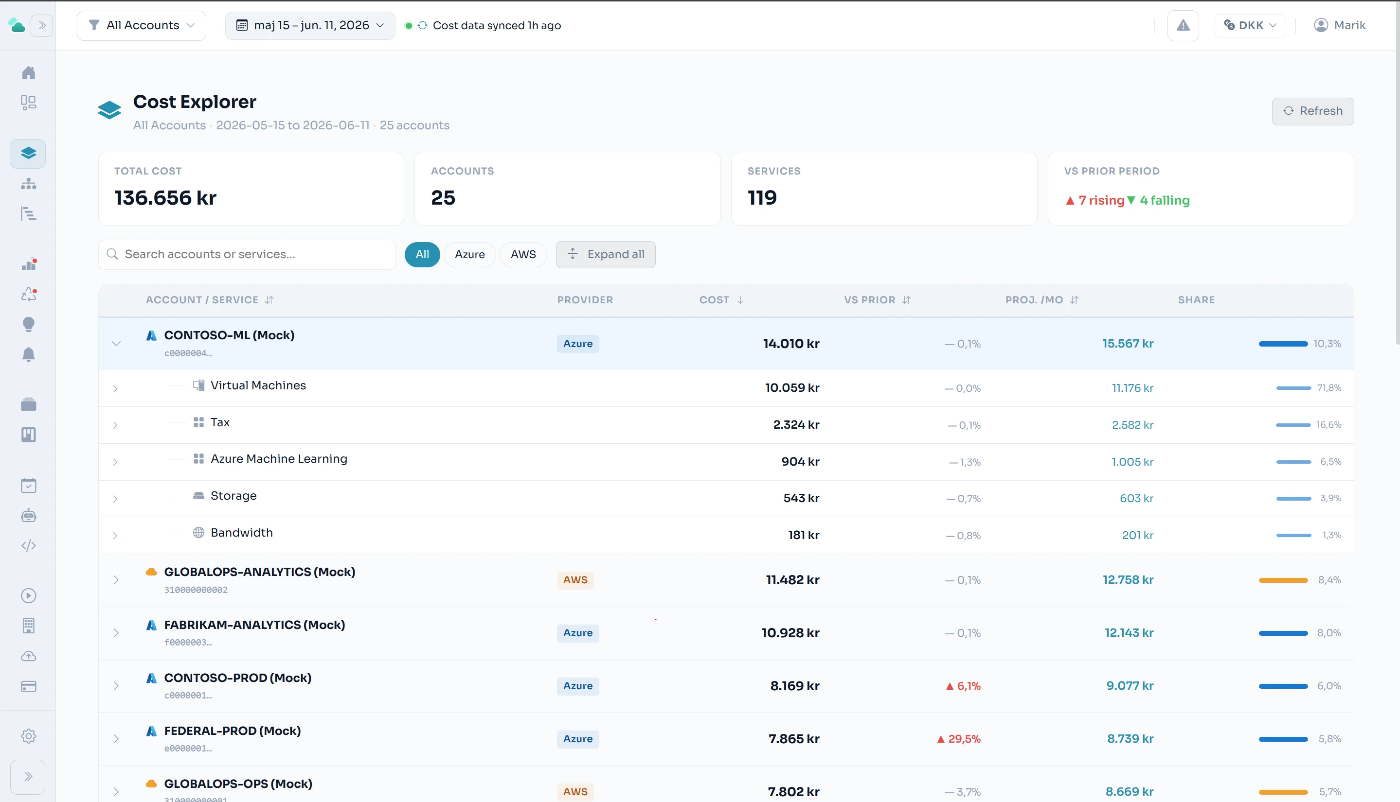
Cost Explorer
Azure + AWSA service-level cost drill-down across every Azure subscription and AWS account, side by side. The native cloud consoles show you one cloud at a time — Cost Explorer shows both, comparable, filterable, and searchable in one view.
Expandable account rows — click to see every service within an account and its period cost
Provider filter: view All, Azure only, or AWS only in a single click
Search across account names and service names simultaneously
Period-over-period trend: shows how many accounts are rising (▲) or falling (▼) vs the prior window
KPI header: total cost, active account count, total services, and trend direction at a glance
Respects the global date range and team scope — scoped to the accounts your role can see
Report storage — bring your own
EnterpriseScheduled reports can be delivered to your own Azure Blob Storage container or AWS S3 bucket — not just to email inboxes. CloudOptify uploads the file, generates a signed download URL with a configurable expiry, and embeds it in the notification. CloudOptify never stores your report files server-side. Your data, your storage, your control.
Optional path prefix — organise reports by team, month, or report type
Signed URLs with configurable expiry (1–30 days) — or raw URL for RBAC-gated buckets
Connection verified before saving — no silent failures on upload night
Multiple destinations per org — route different report schedules to different buckets
Related features
See it on your numbers.
Early access — a new platform, onboarding teams now.